

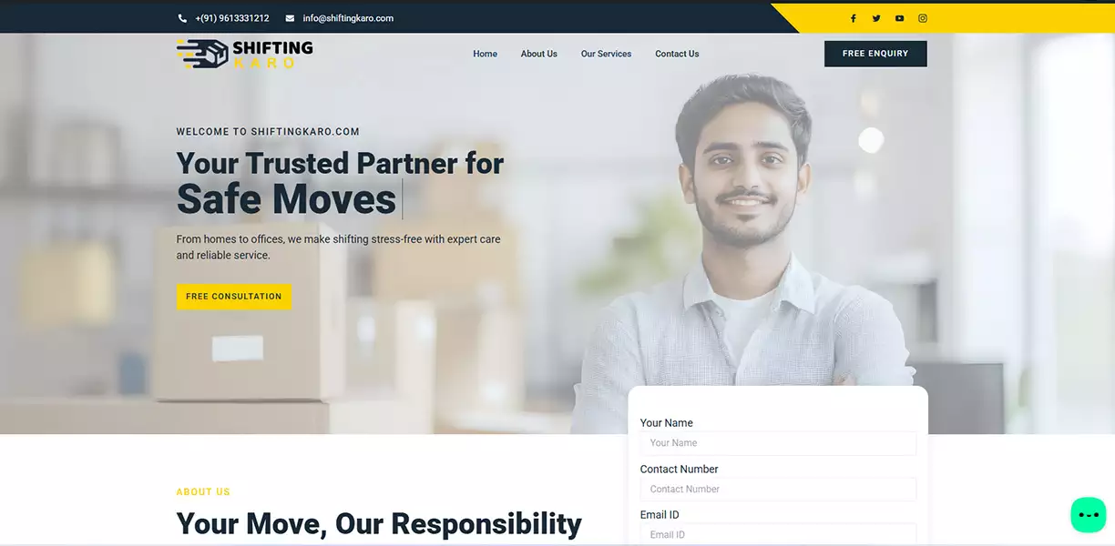
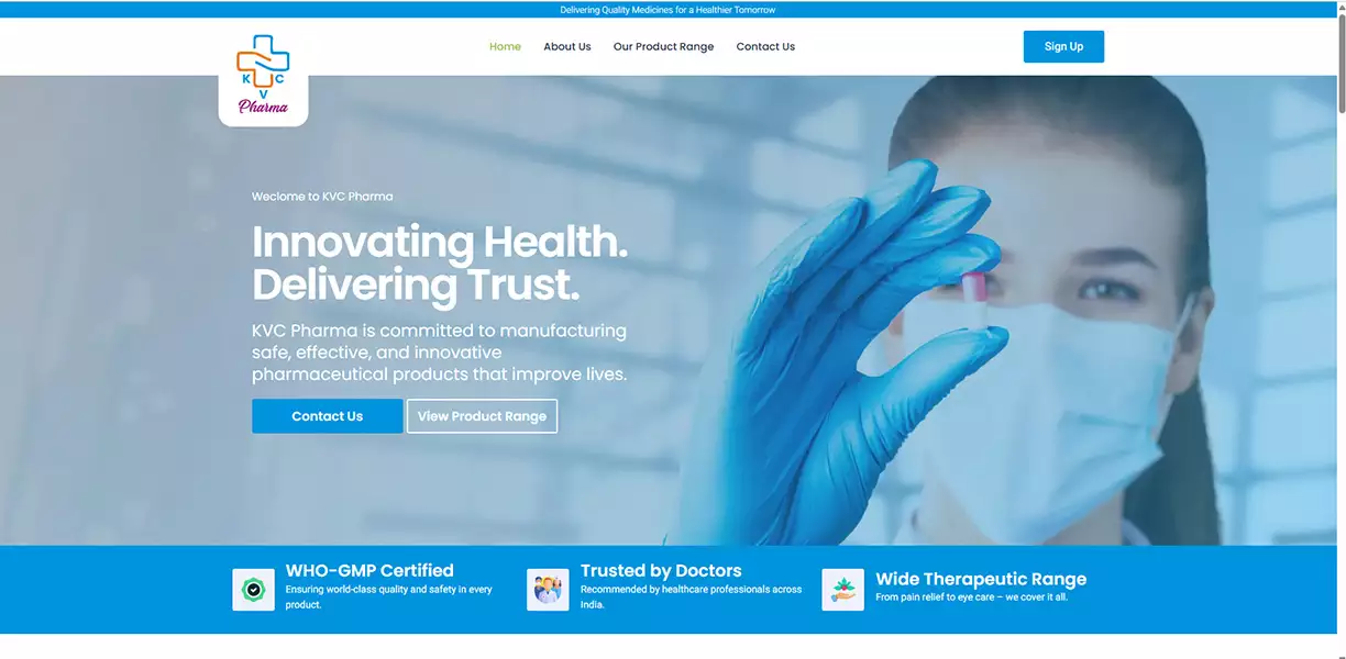
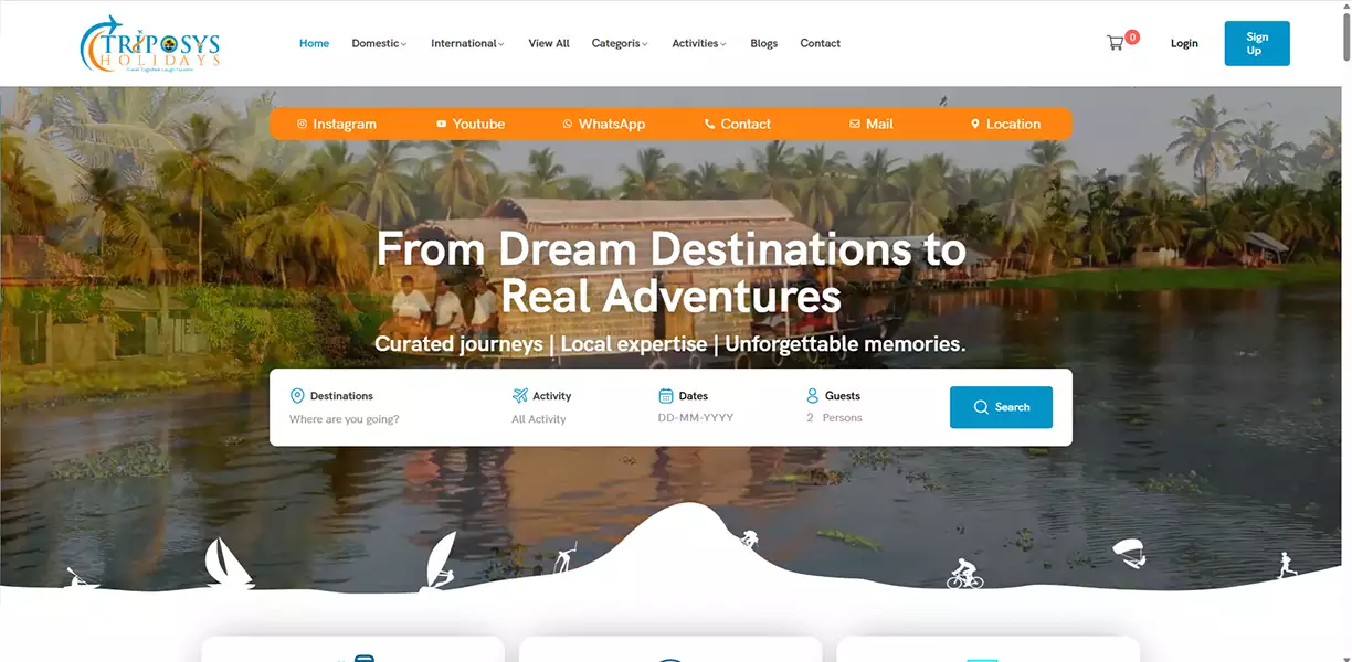
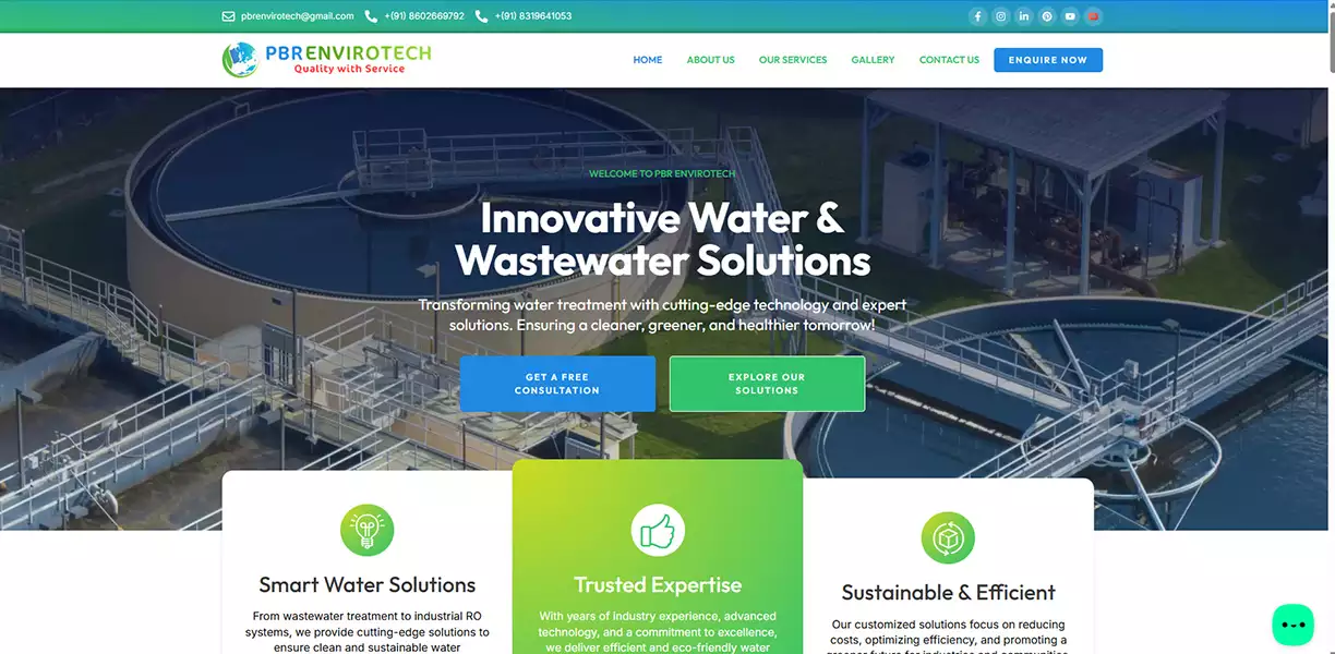
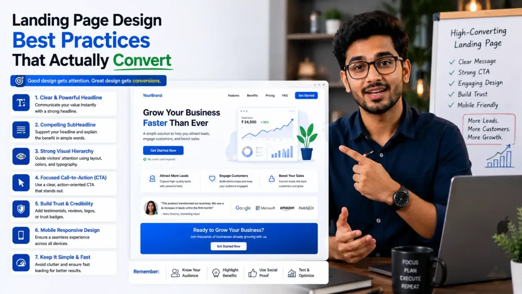
Landing Page Design Best Practices That Actually Convert: Complete Guide
A landing page is the most critical conversion tool you have.
Think about it: You spend money on advertising to drive traffic. That traffic lands on your page. What happens next determines whether you make a profit or lose money.
The Numbers:
- Average landing page conversion rate: 2.3%
- High-performing landing pages: 5-10%+
- Poor landing pages: 0.5% or less
- The difference? Strategic design and psychology.
The gap between a 2% and 10% conversion rate isn’t about luck. It’s about understanding proven landing page design principles and implementing them systematically.
A high-converting landing page can transform your business:
- 100 visitors at 2% = 2 conversions
- 100 visitors at 10% = 10 conversions (5x ROI improvement)
- 10,000 visitors/month at 2% = 200 leads (₹2-20 lakh revenue)
- 10,000 visitors/month at 10% = 1,000 leads (₹20-100 lakh revenue)
This comprehensive guide covers the landing page design best practices that separate 2% converters from 10%+ converters. Implement these, and you’ll see measurable improvement in conversions within weeks.
Why Landing Page Design Matters for Business
The Conversion Economics:
❌ Poor Landing Page:
- Conversion rate: 0.5-1%
- 10,000 visitors = 50-100 leads
- Cost per lead: ₹1,000-2,000
- Revenue from 100 leads: ₹1-10 lakh
⚠️ Average Landing Page:
- Conversion rate: 2-3%
- 10,000 visitors = 200-300 leads
- Cost per lead: ₹300-500
- Revenue from 300 leads: ₹3-30 lakh
✅ High-Converting Landing Page:
- Conversion rate: 5-10%+
- 10,000 visitors = 500-1,000+ leads
- Cost per lead: ₹100-200
- Revenue from 1,000 leads: ₹10-100+ lakh
💡 The Difference: Better landing page design = 5-10x ROI improvement on same traffic
Why Design Matters:
Landing page design affects:
- First Impression (decides if visitor stays)
- Trust Signal (professional design = credible)
- Information Flow (clear path to conversion)
- Motivation (compelling copy + visuals)
- Friction (ease of conversion)
- Mobile Experience (50%+ visitors on mobile)
The 8 Proven Landing Page Design Best Practices
🎯 Practice 1: Clear, Compelling Headline (Benefit-Focused)
The Purpose: Your headline has 3 seconds to convince visitor to stay or leave.
✅ Benefit-Focused (what visitor gains)
✅ “Triple Your Sales With Our Platform”
✅ “Get 10x More Leads Without Spending More”
✅ “Save 5 Hours/Week on Email Management”
❌ “Welcome to Our Platform”
❌ “Learn About Our Services”
✅ Specific & Measurable (numbers work)
✅ “+47% Conversion Rate in 90 Days”
✅ “Reduce Customer Acquisition Cost by 60%”
✅ “Build Landing Pages 10x Faster”
❌ “Increase Conversions”
❌ “Better Results”
Impact: Right headline increases page relevance by 30-50%.
🔘 Practice 2: Single Clear Call-to-Action (CTA)
The Purpose: One clear action (not multiple confusing choices).
✅ Action Word (start with verb)
✅ “Get Free Trial” (vs “Submit”)
✅ “Claim Your Bonus” (vs “Click Here”)
✅ “Download Now” (vs “Learn More”)
✅ “Start Free 14-Day Trial” (specific)
✅ Visual Prominence (stand out)
- Contrasting color (high contrast)
- Larger than other buttons
- Above fold (visible without scrolling)
- Multiple appearances (repeated down page)
Impact: Clear, prominent CTA increases conversions by 20-40%.
📝 Practice 3: Benefit-Driven Subheadline & Supporting Copy
The Purpose: Explain WHY visitor should care (main benefit).
✅ Subheadline Structure:
- Problem Identified: “Struggling to get leads from your website?”
- Solution Offered: “Try our high-converting landing page templates”
- Result Promised: “Get 3-5x more conversions starting today”
✅ Supporting Copy Best Practices:
- Benefit-Focused – What visitor GAINS (not features)
- Scannable Format – Short sentences, bullet points
- Social Proof – “10,000+ customers” or “4.9/5 stars”
Impact: Clear benefit communication increases conversions by 15-30%.
🖼️ Practice 4: High-Quality Relevant Visuals
The Purpose: Images/videos build trust and convey emotion in seconds.
✅ Relevant to Offer
✅ Showing product being used
✅ Happy customer testimonial video
✅ Before/after transformation
❌ Generic stock photos
❌ Unrelated imagery
✅ Video Increases Conversion
- Landing page video: +80% conversion lift
- Short (30-90 seconds)
- Show product in action
- Include captions (50% watch without sound)
Impact: High-quality, relevant visuals increase conversions by 20-40%.
🏆 Practice 5: Trust Signals & Social Proof
The Purpose: Reduce risk perception (visitor worries: “Is this legit?”).
✅ Types of Trust Signals:
- Customer Testimonials: “Increased our revenue by ₹50 lakh in 3 months” – Rajesh Kumar, TechStart India
- Social Proof Numbers: “10,000+ customers” | “₹5 crore value created”
- Logos & Badges: Customer logos, awards, SSL badges
- Case Studies & Results: “Client X: +47% conversion rate”
- Reviews & Ratings: “4.9/5 stars on G2” | “500+ reviews”
Impact: Trust signals increase conversions by 25-50%.
📋 Practice 6: Optimized Form (Friction Reduction)
The Purpose: Make form conversion as easy as possible.
✅ Form Best Practices:
- Minimal Fields: Ask ONLY essential information (3 fields max: Email, Name, Company)
- Smart Field Order: Email first → Name → Company (optional)
- Single-Column Layout: Easier to scan, better on mobile
- Clear Labels: “Work Email Address” (not just “Email”)
- Pre-Selected Options: “India” pre-selected vs blank dropdown
- Action-Oriented Button: “Get My Free Trial” (not “Submit”)
Key Point: Each additional field reduces conversion by 10-25%!
Impact: Optimized form increases conversions by 30-60%.
📱 Practice 7: Mobile Optimization (Critical!)
The Purpose: 50%+ of traffic is mobile – must optimize for small screens.
✅ Mobile Best Practices:
- Responsive Design: Works on all screen sizes, touch-friendly buttons
- Fast Loading: Under 3 seconds (50%+ abandon if slower)
- Single Tap Conversion: CTA clickable with one tap, above fold
- Readable Text: Minimum 16px font, high contrast
- Simplified Navigation: Remove unnecessary menu, focus on conversion
⚠️ Critical: 50%+ traffic is mobile. Unoptimized = 50% lost conversions!
Impact: Mobile optimization increases conversions by 15-40%.
🧪 Practice 8: A/B Testing & Continuous Optimization
The Purpose: Find what actually converts FOR YOUR AUDIENCE.
✅ What to Test:
- Headlines: Benefit-focused vs. curiosity-driven, specific vs. general
- CTA Button: Text, color (red vs. orange vs. green), size
- Form Fields: 3 vs. 5 fields, email first vs. name first
- Visuals: Product image vs. customer using product, video vs. static
- Copy: Benefit vs. feature-focused, short vs. long form
- Trust Elements: With/without testimonials, logos, guarantees
✅ A/B Testing Process:
- Choose one element to test
- Create variation (Variant B)
- Send 50% traffic to each
- Run minimum 100-200 conversions per variant
- Measure conversion rate
- Implement winner
- Test next element
Conversion Rate Formula:
Conversions ÷ Visitors × 100
Example: 60 conversions ÷ 1,000 visitors = 6%
Impact: A/B testing can double conversion rates over time (20%+ improvements).
Landing Page Conversion Checklist
🔴 CRITICAL (Must Have):
Above The Fold:
- Clear benefit headline
- Subheadline explaining why
- Single prominent CTA button
- Relevant high-quality image
- Trust signal/logo
Content:
- 3-5 key benefits (bullet points)
- 2-3 customer testimonials
- Simple form (3 fields max)
- Action-oriented CTA button text
Mobile:
- Responsive design tested
- Mobile load time < 3 seconds
- Touch-friendly buttons
- Readable without zooming
- Form works on mobile
Technical:
- SSL certificate (HTTPS)
- Fast page speed
- No broken links
- Analytics tracking setup
🟡 IMPORTANT (Add for 5-10% Conversions):
- Video demonstrating product/result
- Case study with results
- Money-back guarantee
- Scarcity/urgency element
- Exit-intent popup
- Progressive profiling
- Form field optimization
🟢 OPTIMIZATION (For Maximum Conversions):
- A/B testing framework setup
- Heat mapping to see user behavior
- Session recording to watch user journey
- Form field analytics
- Conversion funnel tracking
- Retargeting pixel setup
📊 Real Case Study: High-Converting Landing Page
The Scenario:
- Company: SaaS tool for email marketing
- Traffic: 5,000 visitors/month
- Original Conversion Rate: 2%
- Problem: Only 100 leads/month = ₹5-10 lakh annual revenue
The Changes:
❌ Before (2% conversion):
- Headline: “Email Marketing Platform”
- Form: 7 fields
- CTA: Light gray “Submit”
- Copy: Features-focused
- Images: Generic stock
- Proof: None
✅ After (8% conversion):
- Headline: “Triple Email Open Rates”
- Form: 3 fields
- CTA: Orange “Start 14-Day Trial”
- Copy: Benefits-focused
- Images: Real customers + video
- Proof: Testimonials + logos
Results:
Before:
- 5,000 visitors/month
- 2% conversion rate
- 100 leads/month
- ₹5-10 lakh annual revenue
After (Month 3):
- 5,000 visitors/month (same)
- 8% conversion rate (4x! 🎉)
- 400 leads/month (4x increase!)
- ₹20-40 lakh annual revenue
+300% MORE LEADS (Same Traffic) | +300% MORE REVENUE (No Extra Ad Spend)
Improvement from single page redesign!
Do’s and Don’ts for High-Converting Landing Pages
✅ DO:
- Do Have Single Clear Goal
One conversion action per page - Do Use Benefit-Focused Copy
What visitor GAINS, not features - Do Optimize for Mobile
50%+ traffic is mobile - Do A/B Test Everything
Test, measure, implement winners - Do Include Social Proof
Logos, testimonials, numbers - Do Keep Form Simple
Start with 3 fields max - Do Use Action-Oriented CTA
Start with verb, include benefit - Do Create Urgency
“Limited time,” “Only X spots”
❌ DON’T:
- Don’t Create Confusion
One goal, one path, no thinking - Don’t Use Generic Stock Photos
Use real customer photos - Don’t Ignore Mobile
Unoptimized = lost conversions - Don’t Add Unnecessary Navigation
Menu and footer distract - Don’t Use Weak CTA
Avoid “Submit” or “Click Here” - Don’t Make Form Too Long
Each field hurts conversion - Don’t Forget Trust Signals
New visitors are skeptical - Don’t Set and Forget
Test, optimize, monitor
FAQs: Landing Page Design Best Practices
Q1: What’s a good landing page conversion rate?
A: Average: 2-3%. Good: 5%. Excellent: 10%+. Industry varies, but these are benchmarks.
Q2: Should I use a landing page or direct to homepage?
A: Always landing page. Dedicated page = 5-10x higher conversion than homepage.
Q3: How many form fields is ideal?
A: Start with 3 max (email, name, company). Each field reduces conversion 10-25%.
Q4: What color CTA button converts best?
A: Red, orange, green all work. Contrast matters more. Test your audience.
Q5: Does video increase conversions?
A: Yes, significantly. 30-90 second video showing product increases conversions 20-80%.
Q6: How often should I A/B test?
A: Continuously. Test one element at time. Implement winners. Continue.
Q7: Should I use urgency/scarcity?
A: Yes, psychologically proven to increase conversions. Use honestly (limited spots, expiration, etc.)
Q8: Is mobile optimization important?
A: Critical. 50%+ traffic is mobile. Unoptimized = 50% conversions lost.
Q9: How long should landing page copy be?
A: Depends on offer. Simple offer: short (300-500 words). Complex: longer (1,000+ words).
Q10: What’s most important for conversions?
A: Clear value prop + trustworthy design + simple form + strong CTA. These 4 = 80% of conversion power.
Conclusion: Landing Page Design is Conversion Science
High-converting landing pages aren’t accidents. They’re engineered.
Every element—headline, copy, design, form, CTA—serves the conversion goal.
Implement these best practices:
- Clear, benefit-focused headline
- Single, strong CTA
- Trust signals throughout
- Simple, optimized form
- Mobile-first design
- A/B testing continuously
Start with these fundamentals. Then A/B test to improve.
A 2% landing page that becomes 5-10% doesn’t just increase revenue—it compounds over time. Your baseline improves continuously, creating exponential growth.
Your landing page is your most powerful conversion tool. Make it count.
Ready to Optimize Your Landing Pages?
At Onetech Solution, we specialize in high-converting landing page design. We’ve helped 50+ clients increase conversion rates by 50-300%.
Our Landing Page Services:
- Landing Page Audit: Identify conversion barriers
- Strategic Redesign: Implement proven best practices
- A/B Testing: Optimize systematically for conversions
- Mobile Optimization: Ensure mobile conversion success
- Conversion Copywriting: Benefit-focused messaging
Get Your Free Landing Page Audit!
📞 Call us: +91 966-988-5053 | +91 8770-70-3080
📧 Email: info@onetechsolution.in
🌐 Visit: https://onetechsolution.in
We’ll audit your landing page, identify what’s killing conversions, and create custom optimization plan.