









Responsive Web Design: Why Mobile-First Matters for Indian Businesses
Introduction
India has emerged as the world’s second-largest smartphone market, with over 750 million active mobile internet users as of 2026. This staggering number isn’t just a statistic—it’s a wake-up call for Indian businesses still relying on desktop-only websites. If your business website isn’t optimized for mobile devices, you’re essentially turning away 3 out of every 4 potential customers.
Responsive Web Design (RWD) has evolved from being a “nice-to-have” feature to an absolute necessity for survival in India’s digital marketplace. With internet penetration reaching tier-2 and tier-3 cities primarily through affordable smartphones, the mobile-first approach isn’t just about keeping up with trends—it’s about staying relevant and competitive.
In this comprehensive guide, we’ll explore why responsive web design matters specifically for Indian businesses, how mobile-first design can transform your online presence, and actionable steps to implement these strategies effectively.
What is Responsive Web Design?
Responsive Web Design is a web development approach that creates websites capable of adapting seamlessly to different screen sizes, platforms, and orientations. Whether your customer is browsing on a 6-inch smartphone, a 10-inch tablet, or a 27-inch desktop monitor, a responsive website automatically adjusts its layout, images, and functionality to provide an optimal viewing experience.
Key Components of Responsive Web Design
1. Flexible Grid Layouts Rather than fixed-width pixels, responsive designs use percentage-based widths that scale proportionally across devices. This ensures content remains readable and accessible regardless of screen size.
2. Fluid Images and Media Images and videos automatically resize within their containing elements, preventing horizontal scrolling and distorted visuals on smaller screens.
3. CSS Media Queries These allow developers to apply different styling rules based on device characteristics like screen width, resolution, and orientation, ensuring the website looks perfect everywhere.
4. Mobile-Friendly Navigation Hamburger menus, collapsible sections, and touch-optimized buttons replace traditional navigation bars for better mobile usability.
Understanding Mobile-First Design Philosophy
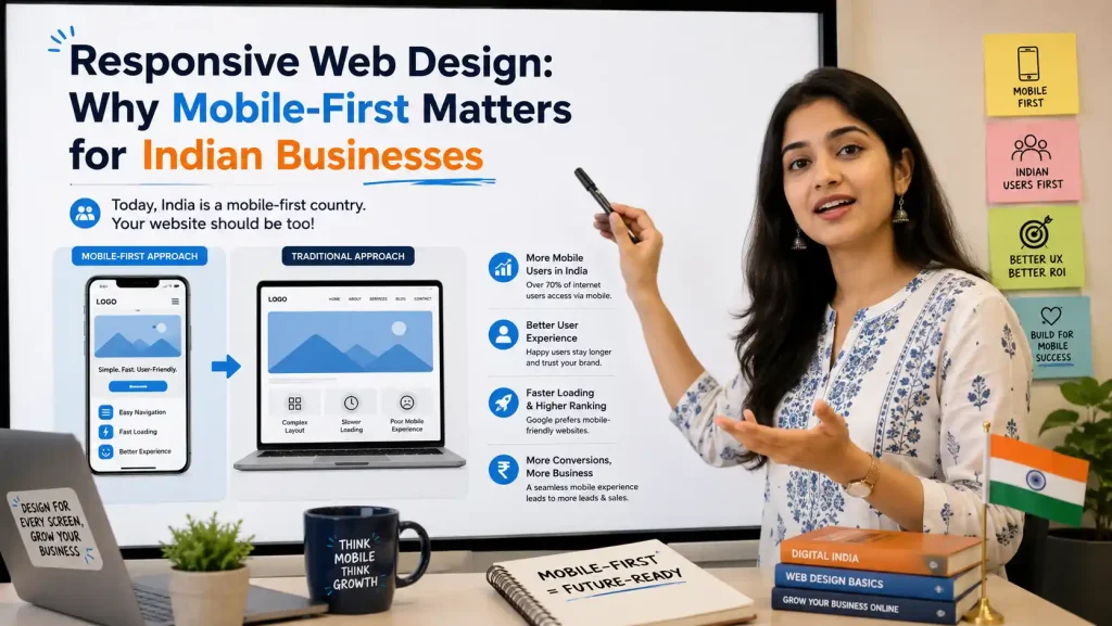
Mobile-first design flips traditional web development on its head. Instead of designing for desktop computers first and then scaling down for mobile devices, mobile-first starts with the smallest screen and progressively enhances the experience for larger displays.
Why Mobile-First Makes Sense for India
The Numbers Tell the Story:
- 67% of Indian internet users access the web exclusively through mobile devices
- Average daily mobile usage in India: 4.9 hours (among the highest globally)
- Mobile commerce in India is projected to reach ₹8.5 trillion by 2026
- Google prioritizes mobile versions of websites for indexing and ranking (Mobile-First Indexing)
Indian consumers have leapfrogged the desktop era entirely. Many first-time internet users in rural and semi-urban areas have never used a desktop computer—their smartphone IS the internet. For businesses targeting this demographic, mobile-first isn’t optional; it’s the only sensible approach.
Why Responsive Web Design is Critical for Indian Businesses
1. Explosive Mobile Growth Across Bharat
The real growth story in India isn’t happening in metros—it’s in smaller towns and villages. Cities like Raipur, Patna, Indore, and Coimbatore are witnessing unprecedented digital adoption. These users primarily rely on affordable Android smartphones with varying screen sizes and processing capabilities.
A responsive website ensures you’re accessible to this massive, underserved market. Non-responsive websites often load incorrectly on these devices, leading to immediate bounce rates and lost business opportunities.
2. Google's Mobile-First Indexing
Since 2019, Google predominantly uses the mobile version of websites for indexing and ranking. This means if your mobile site is slow, broken, or non-existent, your search engine rankings will suffer dramatically—even for desktop searches.
For Indian businesses competing in local SEO (like “best restaurant in Pune” or “dentist near me in Jaipur”), having a mobile-optimized website is the difference between appearing on page one or page ten of search results.
3. Improved User Experience = Higher Conversions
Studies show that 53% of mobile users abandon websites that take longer than 3 seconds to load. In India, where many users still rely on 3G or 4G connections with variable speeds, website performance is even more critical.
Responsive websites with mobile-first design principles:
- Load 40-60% faster on mobile devices
- Reduce bounce rates by up to 35%
- Increase mobile conversions by 2-3x
- Improve average session duration by 50%
4. Cost-Effective Solution
Many Indian businesses previously maintained separate desktop and mobile websites (like www.example.com and m.example.com). This approach is:
- Expensive to develop and maintain
- Creates duplicate content issues for SEO
- Leads to inconsistent user experiences
- Requires separate marketing strategies
A single responsive website solves all these problems, reducing development costs by 30-50% while providing superior functionality.
5. Competitive Advantage in Regional Markets
While large corporations have embraced responsive design, many small and medium Indian businesses still lag behind. Implementing responsive web design gives you an immediate competitive advantage in your local market.
If you’re a boutique in Lucknow or a coaching center in Kota, having a mobile-optimized website when your competitors don’t can be the decisive factor for customers choosing you over them.
Real Impact: Responsive Design Success Stories in India
Case Study 1: E-commerce Retailer
A Bangalore-based fashion retailer redesigned their website with mobile-first principles in 2025. Results within 6 months:
- Mobile traffic increased by 145%
- Mobile conversion rate improved from 0.8% to 2.3%
- Average order value on mobile increased by ₹320
- Search engine rankings improved for 78% of target keywords
Case Study 2: Local Service Business
A Delhi-based home services platform implemented responsive design:
- Mobile bookings increased by 210%
- Customer support calls reduced by 40% (better mobile UX)
- Page load time decreased from 6.2 seconds to 1.8 seconds
- Google Business Profile engagement increased by 167%
Essential Responsive Web Design Best Practices for Indian Businesses
1. Prioritize Page Speed
With varying network conditions across India, speed is non-negotiable:
- Compress images using modern formats like WebP
- Minimize CSS, JavaScript, and HTML files
- Implement lazy loading for images and videos
- Use Content Delivery Networks (CDN) with Indian servers
- Target: Page load time under 2 seconds on 3G connections
2. Design for Touch Interactions
Mobile users navigate differently than desktop users:
- Buttons should be minimum 44×44 pixels for easy tapping
- Adequate spacing between clickable elements (prevents mis-taps)
- Eliminate hover-dependent interactions
- Use large, thumb-friendly navigation elements
- Implement swipe gestures where appropriate
3. Optimize Content for Small Screens
- Use shorter paragraphs (3-4 lines maximum)
- Increase font sizes (minimum 16px for body text)
- Ensure sufficient contrast for outdoor viewing
- Break content into scannable sections with clear headings
- Use bullet points and numbered lists liberally
4. Implement Progressive Disclosure
Don’t overwhelm mobile users with information:
- Use accordions for FAQs and detailed content
- Implement “Read More” buttons for long descriptions
- Show critical information first, details on demand
- Use collapsible menus for navigation
5. Localize for Indian Users
- Support multiple Indian languages (Hindi, Tamil, Telugu, Bengali, etc.)
- Integrate popular Indian payment gateways (UPI, Paytm, PhonePe)
- Display prices in Indian Rupees (₹)
- Consider local holidays and festivals in design elements
- Use culturally relevant images and examples
6. Test Across Multiple Devices
India has diverse smartphone usage:
- Test on budget Android devices (₹7,000-15,000 range)
- Check performance on older Android versions (8.0, 9.0)
- Verify functionality on different screen sizes (5-6.5 inches)
- Test with actual 3G/4G network conditions using Chrome DevTools throttling
Technical Implementation Checklist
For Developers:
<!– Viewport Meta Tag (Essential) –>
<meta name=”viewport” content=”width=device-width, initial-scale=1.0″>
<!– Responsive Images –>
<img srcset=”image-320w.jpg 320w,
image-640w.jpg 640w,
image-1280w.jpg 1280w”
sizes=”(max-width: 320px) 280px,
(max-width: 640px) 600px,
1200px”
src=”image-640w.jpg” alt=”Description”>
CSS Media Queries:
Technical Implementation Checklist
- Mobile: max-width: 767px
- Tablet: 768px – 1024px
- Desktop: min-width: 1025px
Performance Optimization:
- Enable GZIP compression
- Implement browser caching
- Use asynchronous loading for non-critical JavaScript
- Minimize HTTP requests
- Optimize critical rendering path
Common Mistakes to Avoid
❌ Don't Do This:
- Blocking Resources: Don’t block CSS or JavaScript from Googlebot
- Intrusive Interstitials: Avoid full-screen pop-ups on mobile that hide content
- Unplayable Content: Don’t use Flash or other non-mobile-compatible technologies
- Tiny Text: Never use font sizes smaller than 12px
- Horizontal Scrolling: Content should never require horizontal scrolling
- Separate Mobile URLs: Avoid m.domain.com structure; use one responsive domain
- Desktop-Only Features: Don’t hide critical functionality on mobile versions
- Ignoring Landscape Mode: Test and optimize for both portrait and landscape orientations
✅ Do This Instead:
- Use Responsive Images: Serve appropriately sized images for each device
- Enable Click-to-Call: Make phone numbers tappable for easy calling
- Optimize Forms: Use appropriate input types (email, tel, number) for better mobile keyboards
- Test Regularly: Use Google’s Mobile-Friendly Test and PageSpeed Insights
- Monitor Analytics: Track mobile vs. desktop performance separately
- Get Real User Feedback: Conduct usability testing with actual Indian users
Measuring Success: Key Metrics to Track
1. Mobile Traffic Percentage
Aim for steady growth in mobile visitors. Indian businesses should target 60-70% mobile traffic.
2. Mobile Bounce Rate
Should be comparable to desktop (ideally under 50%). Higher mobile bounce rates indicate UX issues.
3. Mobile Conversion Rate
Track separately from desktop. Goal: Mobile conversions within 70-80% of desktop rates.
4. Page Load Time
Target: Under 2 seconds on 3G, under 1 second on 4G.
5. Mobile Search Rankings
Monitor keyword rankings specifically for mobile searches.
6. Core Web Vitals
- LCP (Largest Contentful Paint): Under 2.5 seconds
- FID (First Input Delay): Under 100 milliseconds
- CLS (Cumulative Layout Shift): Under 0.1
Conclusion: The Mobile-First Future is Now
For Indian businesses, responsive web design and mobile-first strategy are no longer competitive advantages—they’re baseline requirements for digital survival. With mobile internet users outnumbering desktop users by a 3:1 ratio and Google’s mobile-first indexing in full effect, the question isn’t “Should we go mobile-first?” but “How quickly can we implement it?”
The businesses that thrive in India’s digital economy will be those that understand their customers’ journey starts—and often ends—on a smartphone. Whether you’re a local kirana store expanding online, a B2B service provider, or an e-commerce platform, your mobile experience directly impacts your bottom line.
Start your responsive web design journey today. Audit your current website, identify mobile UX gaps, and prioritize improvements based on your business goals. Remember, in India’s mobile-first digital landscape, your website’s responsiveness isn’t just about technology—it’s about respecting and serving your customers where they are.
Ready to transform your website with responsive design? Contact us for a free mobile optimization audit and discover how mobile-first design can accelerate your business growth.
FAQs About Responsive Web Design for Indian Businesses
Q1: How much does it cost to make a website responsive in India?
Ans: Costs vary from ₹30,000-₹3,00,000 depending on complexity. Simple business websites start around ₹50,000-₹1,00,000, while e-commerce platforms can cost ₹2,00,000+. Consider it an investment—improved conversions typically recover costs within 6-12 months.
Q2: Will responsive design affect my current Google rankings?
Ans: If done correctly, it improves rankings. Ensure proper redirects, maintain URL structure, and test thoroughly before launching. Avoid common migration mistakes like blocking resources or changing content structure drastically.
Q3: How long does it take to redesign a website to be mobile-responsive?
Ans: Typically 4-12 weeks depending on size and complexity. A 10-page business website might take 4-6 weeks, while a large e-commerce site could require 10-16 weeks including testing.
Q4: Can I just create a separate mobile website instead?
Ans: Not recommended. Separate mobile sites (m.domain.com) are outdated, expensive to maintain, create SEO issues, and provide inconsistent user experiences. Responsive design is the industry standard.
Q5: Do I need to change my content for mobile users?
Ans: Content should be the same, but presentation differs. Use shorter paragraphs, larger fonts, and progressive disclosure. Priority information should appear higher on mobile screens.
Q6: How do I test if my website is mobile-friendly?
Ans: Use Google’s Mobile-Friendly Test tool, Chrome DevTools device emulator, and test on actual devices. Also check Google Search Console for mobile usability issues.
Q7: Will responsive design make my website slower?
Ans: Not if implemented correctly. Responsive designs can be faster because they serve appropriately sized images and eliminate redirects. Focus on performance optimization alongside responsive design.
Q8: Should I use a responsive website template or custom design?
Ans: Templates (like WordPress themes) work well for small businesses and startups. Custom designs suit larger businesses needing unique functionality. Choose based on budget, timeline, and specific requirements.
Ready to Make Your Website Mobile-First in 2026?
At Onetech Solution, we specialize in crafting modern, high-converting responsive websites that align with the latest mobile-first trends. Our expert team will help you dominate the Indian digital market by:
✅ Designing custom, mobile-responsive layouts (Bento Grids & Generative UI)
✅ Implementing lightning-fast, mobile-optimized designs that load in under 2 seconds
✅ Upgrading your website with seamless WhatsApp API automation for better customer engagement
✅ Ensuring your website ranks higher with Google’s mobile-first indexing
✅ Boosting your overall SEO rankings and lead conversions by 200%+
Get a Free Responsive Web Design Consultation Today!
📞 Call us: +91 966-988-5053 | +91 8770-70-3080
📧 Email: info@onetechsolution.in
🌐 Visit: https://onetechsolution.in
Located in Indore: EE42, Super City, Near Gyanshila Square, Dhhabli, Indore (M.P.)
Don’t let an outdated website hold your business back. Contact Onetech Solution today and turn your website into a modern, high-performance, mobile-first conversion machine!